If you are starting out in the real estate business or looking at improving an existing business then you have to give some serious thought to your logo design.
A logo design is a key part of the marketing strategy for any business. It can be used to create an identity for a property business and to project the desired image. As a realtor or property professional, it is important that you make a great first impression on your clients and that you focus on building a strong brand reputation over time. You want to be seen as a trustworthy and reliable firm to do business with and a logo can definitely help to shape customer perceptions in your favor.
In this article we offer some advice and ideas on how you can get the logo design that you need to represent your real estate company.

A Variety of Uses
A realtor or property management logo must be suited to a variety of purposes. It must be able to be scaled up and displayed on signage on properties that you have listed. It also has to look great when scaled down to a size suitable for business cards. You will also be featuring your logo on numerous other printed marketing materials and possible even on your vehicles. Logos that are simple in design are usually more functional and easy to scale.
Typical Real Estate Logo Images
While a simple text logo can work well for realtors it is more common for real estate logos to feature an image or symbol in combination with text.
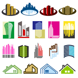
When it comes to choosing an image for your logo you will need to decide if you want an obvious 'property related' image or something more abstract. It is common for real estate businesses to include images, shapes or silhouettes of houses and buildings so that people can automatically understand what their business is about.
The problem with 'obvious images' is that the same ones get used repeatedly and you take a risk that you will end up having a logo that looks the same as all of your competitors. You also run the risk of getting sued for trademark infringement if your design is too similar to other companies. The outline of a roof is really clichéd for residential real estate logos and a city skyline is over used in the commercial sector. However, a great designer should be able to take an over used image and put an original spin on it that makes it appear unique.
Alternatively you can look at using an image that is not directly related to property. It could be an image of something that symbolizes what your business is about or how you are different from other market players.
Inspiration for Real Estate Business Logos
One great way to get inspiration for your real estate logo is to do a Google image search for the term 'real estate logos'. This will bring up a huge variety of designs that are used by a variety of firms around the world.
You can also look at the logos of other real estate businesses in your area. The idea is to come up with something original that will help you to stand out though so don't allow your competitors logos to influence you too much.
Many online design firms also feature large portfolios on their websites. These portfolios sometimes include a whole section just for realtor logos.
You can get a lot of inspiration by studying the logos of some of the big players in the real estate and property industries. These have usually been put together by top design firms and have evolved over the years along with the businesses that they service. The Century 21 logo is a great example of a highly effective logo. Bold lettering, a simple outline of a roof and minimal color make this logo memorable and appealing.
Color Choice
The various colors in a logo can help to convey a message to the viewer and stir their emotions. Blue promises professionalism and reliability and is therefore popular with real estate logos. Gold is also a popular color in the industry as it alludes to quality and prestige.
To keep the design simple you should limit the variety of colors to two or three. Minimal color use also makes it easier when it comes to printing. You should also remember that a good design should look great in black and white when it is faxed or photocopied.
Font Style
The font that you use for the wording part of your logo also makes up an important part of the overall impression that people will get from it. Your designer should be able to offer a variety of fonts and make a recommendation.
In addition to your business name, you may also want to request a variation of your logo that has a slogan. This kind of tag line is quite common in the real estate business and having a version of your logo to suit different marketing campaigns could be convenient.
Working with a Designer
The best way to get an affordable logo that has been designed specifically for your business is to use an online custom logo design firm. They will attempt to understand your business and offer you a selection of concepts to consider. Once you have selected your favorite they will work with you to make minor adjustments until you are happy with the final product.
Put some time into briefing your designer or design team before they start the design process. Let them know what you are after in the way of an image and color combination. Tell them about your services and your typical clients. Let them know how you want your business to be perceived and what qualities you want to emphasize in the design. You can also refer them to some logos that you like and they may be able to incorporate elements of those designs into your design without imitating them too closely.
Think carefully about your final decision as it is not easy to change a logo once your business is underway. Your real estate logo will be with you for a long time to come so be sure to invest the time and finds into making sure that you get something that is going to work well for your business.
Love this site, thanks highly appreciated.
ReplyDeleteaffordable logo design